To evaluate means to measure or estimate the nature, quality, ability, extent, or significance of.
The last hurdle. After having completed vast amounts of research and planning, and creating my three media products I will now evaluate the outcome by discussing the highs and lows that I have faced, and also, I will be explaining what my target audience thought of the final products.
Codes and conventions are the staples of any media text. They hold everything together and define what the text actually is. When analysing existing media texts, for magazines, posters and trailers, I was able to pick out and recognise the codes and conventions that were attached to each type of media. These analyses’s allowed me to become familiar with the appropriate codes and conventions and made it easier to transport them over to my own three media texts.
Looking at my final products, I can see that I have followed main codes and conventions on all three of my media pieces.
By following codes and conventions and looking at existing media texts, it has allowed my media text to appear professional and believable as it shares the characteristics with those high up, successful magazines such as EMPIRE and Total Film. With the magazine front cover, I ensured that the masthead was placed at the top of the page which you will find on every magazine and I ensured that the image was dominant. Also a barcodeatract the correct TA. The name of the actor/actress in the film that the magazine’s front cover is promoting e.g. Katie Mills. The name of the film being the second largest piece of text on the page and finally, like film posters, the image is used to suggest the main genre of the film.
By following codes and conventions and looking at existing media texts, it has allowed my media text to appear professional and believable as it shares the characteristics with those high up, successful magazines such as EMPIRE and Total Film. With the magazine front cover, I ensured that the masthead was placed at the top of the page which you will find on every magazine and I ensured that the image was dominant. Also a barcodeatract the correct TA. The name of the actor/actress in the film that the magazine’s front cover is promoting e.g. Katie Mills. The name of the film being the second largest piece of text on the page and finally, like film posters, the image is used to suggest the main genre of the film.

Now looking at my poster, you can see the typical conventions have again been followed. For example, the image is dominant, and takes up most of the page. Text is minimal, yet effective, bold and clear, allowing the poster to be noticed at a distance. Film logos and a website address have been placed at the bottom, where you would find them on most film posters and finally, the inclusion of a tagline is conventional. By following these codes and conventions, like the magazine my audience are able to define and recognise the style of media it is. Then, in more detail, other conventions that I have used are ones such as; the image reflects the narrative and genre of film that the poster is promoting. This will allow the correct target audience to be lured in, and in this case, a horror loving audience. As my poster is a ‘teaser’ it should remain simple, not including too much text allowing the image and title to speak for itself. My film poster reflects the genre of horror through the conventional aspects you would associate with that genre. For example, a strong contrast betweeen light and dark lightings and colours, the harsh stare of a demented child, the style of font that I have used is creepy, eerie and red which also suggests the horror genre. The tagline in itself also reflects the horror genre as it sounds mysterious, creepy and scary.

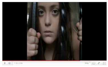
My film trailer, like my ancillary tasks is conventional. I follow the codes and conventions that my audience expect to see closely and specifically. I have followed the typical structure of a film trailer; the beginning which lays out the key element of the story, a middle section that tells us more about the narrative and then that reaches a climax which is a visual montage of edits. By following this structure, it enabled me to build tension and suspense, and also aids audience understanding as they narrative is in order. The tension and suspense then leads the audience to a sting, a conventional ending to a horror film trailer, one last burst of fear. For example, this is the case in most horror film trailers but the one that had inspired me most was the sting at the end of 'Orphan'. It was extremely effective and definately made me jump, which is the intention. Also, conventionally, I have kept enough of the story back to create inrigue and suspense.
Another convention that I have included at the beginning of my film trailer is that I have included the film company logo, letting my audience know what company this film has been made by, in this case “Dark Castle” and they will be able to recognise the logo and relate the success of this new film, to previous successes from the same company. Including a film logo also adds a touch of professionalism too.
Another is that it is 2 minutes long, the typical length for a film trailerm, 'The Uninvited' trailer, for example, is 2 minutes 10 seconds in length. I think that by not having the trailer lasting over two minutes is important as you do not want to bore or tire the audience, and you do not want to give away to much of the narrative, instead, you are aiming to lure them in, and leave them wanting more.
Throughout the trailer, i have used conventional mise en scene elements allowing my audience to understand the horror genre that my film lies in. For example; i have used dark lighting throughout the trailer, eerie and creepy music has been used to create fear and suspension. This can also be found in the trailer for 'Orphan' where throughout, the lighting is dark, definately more so towards the end of the film trailer and in the climax. Costume and hair and makeup is also conventional for a psychological horror film trailer, for example, dark makeup making the antagonist look sinister, ‘bed head’ hair in order to make the antagonist look neglected or un cared for, and likewise with the protagonists, to make them look like they have been through an ordeal etc. I have also followed conventional editing styles that you are more than likely to see in any film trailer, of any genre. For example, dead black outs are a familiar edit used that can be seen occurring regularly in my film trailer. A good example of this that I have found whilst looking into existing media texts is suring the 'Silent Hill' film trailer where a lot of dead black outs have been used for effect and to create suspense and intrigue. I used this particular editing style a lot as I feel that it is effective in building tension and creating suspense, therefore creating fear which is one of the main feelings that a horror loving audience want to get out of viewing a film trailer.
Now, looking back on my three media products, after having followed main codes and conventions, there are elements that have been challenged, aiming to make my pieces original and interesting. Starting with the magazine front cover, I decided to make it a special edition cover with only one sell line as I wanted the image to do all the talking and also I wanted the cover to be a celebration primarily of this film, longing to do something different as a statement of the fact that this is a special edition cover. It looks equally effective and the special edition cover/ exclusive allows the audience to feel as they are first to see/ read about the new film, making them feel special, and allows the whole film seem exciting. With sell lines in general, I had placed them in a new and different way, challenging the normal convention where by the sell lines would be placed either side of the image.This will entice the readers as it is something new and refreshing, but will not scare them off for being too different as the main codes and conventions are still in place.
With the film poster, instead of creating an average poster, I decided to make it a ‘teaser’ film poster, as like the magazine with its limited edition element, it makes the audience feel like they are getting an exclusive sneak preview, and makes them feel special. Another way in which I have challenged the codes and conventions of film posters was by not including iconography on my poster. A lot of film posters use iconography to suggest the genre of the film but I felt that by simply using a close up of my main character, ‘Ruby’ I was able to suggest the horror genre by her expression and other elements on the page such as text and colour. I didn’t want to give away too much of the narrative as my audience are those who prefer having to work out the narrative rather than it being given to them on a plate.
With my film trailer, I have followed the conventional structure and speed of editing and of the trailer in general, and therefore have not challenged any conventions in this sense.


Having used several symbiotic links, I feel that my target audience will be able to put all three together and recognise different elements that they have seen on one or the other media piece. It also acts as a puzzle, putting two and two together to see if they belong to the same film which will interest and entice my audience as they are those who enjoy mystery and have the minds of those who enjoy having to work things out. Also by using links like the ones I have mentioned previously, allows my three pieces to support and complement each other creating a successful and effective promotional package.
I have also specifically appealed to my individual target audience of females due to the fact that the typical male conventions would be those found in a slasher horror film for example 'Scream', 'Saw' and so on with guts, gore and gruesomeness which may put a female off. The methods I have used to scare my audience are subtle yet effective. They are more mind cramping ways which make the audience have to think which is something my target audience love to do when watching a horror film, for example, having to work things out, or trying to guess what they think will happen in the end.
Looking way back to the start of the planning stages where I had handed out a questionnaire to the audience at whom I was going to be targeting my film towards, asking them what they hope to see in a horror, what they find most effective and so on, I feel like I have met all of their needs and included everything that they wanted to see and hear in all three pieces. For example, one question that I had asked was ‘What do you find most effective when watching a horror film trailer?’ I had received back that ‘70% of participants stated that they find ‘sound’ most effective when watching the film trailer. The remaining 30% chose ‘the actual footage used’ with not one of my participants choosing ‘lighting’ or the ‘characters’. Because of this response, I decided that I needed to take more time and explore more sounds and music as this was something that my audience found most important. I also have appealed to my target audience through all three media pieces as they are a group of people who enjoy watching Psychological/ supernatural horror films. As I have expressed the genre through these media pieces, I am able to draw in my target audience as they will be able to recognise the codes and conventions linked to this genre, for example, the fact that the main character is a child is a common convention found in this type of horror e.g. ‘Orphan’, ‘The Unborn’ and so on are other psychological/ supernatural, successful and well known horror films.
Recapping on my target audience; she is a female between the ages of 18 and 30. They enjoy mystery and confusion and are currently employed with an ABC1 bracket career. She is a sophisticated, confident woman, who loves to go out with her friends and family. Some of her main interests and hobbies are reading horror-based novels and watching horror films as she has an active mind and thrives on enigma and fear. She loves to attend the cinema to watch a horror and other hobbies include running, shopping, and reading magazines such as Cosmopolitan and Gratzia, when she craves lighter reading material.
Recapping on my target audience; she is a female between the ages of 18 and 30. They enjoy mystery and confusion and are currently employed with an ABC1 bracket career. She is a sophisticated, confident woman, who loves to go out with her friends and family. Some of her main interests and hobbies are reading horror-based novels and watching horror films as she has an active mind and thrives on enigma and fear. She loves to attend the cinema to watch a horror and other hobbies include running, shopping, and reading magazines such as Cosmopolitan and Gratzia, when she craves lighter reading material.
For the post production research, I decided to use a modern and technical method. Facebook is a social networking website which allows friends and family to interact over the internet, sharing stories and pictures. Due to the fact that my target audience are in their late teens going onto early adulthood, I thought that this would be a good method in being able to get the information I needed, from the people that I needed, as facebook is generally used in these age brackets. Facebook also allows the feedback to be more personal, interactive and open. Also, I wanted to receive the feedback in the most interesting and easiest possible way, keeping my target audience interested until the very end. I conducted a ‘note’ which consisted of questions linking to my three media pieces where I ‘tagged’ 15 people who suited the criteria of my target audience. They answered each question telling me what they thought and how I could improve. Also, I decided to record some of the responses on video as this is another way of making the entire process more technical and interesting.
Having carried out the post production research, the overall response was a positive one. I was able to see this right from the word go as the first question I had asked, regarding the film poster alone was ‘From looking at the film poster that I have designed and created to promote my horror film, ‘Ruby’, would this be a film you would wish to view in the cinema/ DVD?’ Every single response was relieving and positive. For example, each response to this question was “Yes!” or “Oh I would love to see this movie”. I found out that the most effective part of the poster was the image, as each person described either the image in general or a small part of the image to be their favorite and most effective part. For example;
“I love the way you gave detail in her eyes, it’s my favorite part”
And
“The use of an extreme close-up shot makes the poster more alluring. My attention was immediately drawn towards her eyes; the redness of which is captivating”.
This reassured me that I had effectively used camera to suggest genre and to draw in my target audience. Each person was able to signal the genre through Mise en scene elements.
“The elements of Mise-en-scene and uses of colour successfully represent the genre of horror”.
My target audience also liked the fact that I had followed codes and conventions which was shown when I asked “Does this poster meet all the needs and expectations that you desire to see when looking at a film poster?” where I got responses such as...
“Yes because it follows the conventions of a film poster”.
Although the feedback about the poster was all positive, I had asked where they could see room for improvement and received from each individual that the tagline could be made clearer with feedback such as...
“Perhaps for the tagline you could have used a bolder font to make it stand out more”
And
“maybe the tag line could stand out a bit more”
and so on.
And
“maybe the tag line could stand out a bit more”
and so on.
With the magazine, again I started by asking a general question about the overall appearance ‘After first glance, what did you think about this magazine front cover?’ I received answers such as ‘wow, that film would freak me out’ and ‘weird, scary, but that is what I love’. They were able to point out to me the symbiotic links;
“There is evidence of continuity within the three pieces; you have kept the costume/hair/make-up the same, but have played around with different shots, facial expressions and body language”
And they also thought that fact that I had made a limited edition front cover was interesting and exciting;
“I like the minimalistic layout as its clean, fresh and sophisticated”
And also someone pointed out that
“I was drawn to the front covers simplicity. It’s not too cluttered or overwhelming like most magazines are and draws attention to the main feature of the edition”.
This allowed me to realize that I had in fact taken the right path when deciding whether or not to create a limited edition cover.
Like the film poster questions, I asked my target audience if they felt there was room for improvement in order to see if my pieces could benefit from this constructive criticism. Some people answered with the comment that they felt there were no improvements needed and others argued that the limited edition text placed at the top of the page could have been bolder and clearer.
Like the ancillary task questions, I asked a general one first ‘After watching this film trailer, what were your general, overall feelings/ impression?’ where I received answers such as...
“It didn’t fail to make me jump! I think the use of sound was very effective and your editing skills are clearly amazing!”
And
“I thought it was of a very high quality, the music and editing had worked well to create a horror theme/ image and definitely made me feel scared”
With responses such as these I was straight away able to see that my target audience loved the trailer and looked at it in a professional way, which is definitely what I wanted! All participants who answered the questions straight away were able to point out the horror genre and were able to understand the narrative...
“You have successfully integrated film clips and strap lines in a way that visually informs audiences of the film plot”
When I asked what they felt was most effective, it was a mixed response. Some said that it was the sound and music for them...
“the creepy voice when she says ‘I will never forget what you did to me’ that was what had me the most scared”
And
“the sound effects are most effective to me as the music and screaming adds the feeling of anxiety”
Others agreed that it was the editing devices such as the sting and the straps...
“I like how the voice over is followed by a second strap that says ‘never forget’, its effective in getting the audience’s attention and intrigue. I also love the sting! No matter how many times I watch it, it always makes me jump”.
This shows me that it is always important to focus on all areas of the media i.e. sound, editing, mise en scene and more due to the fact that although my target audience are a very similar group of individuals, with similar interests and tastes, each individual still have different feelings and styles, therefore making it crucial that all areas are as professional, exciting and as chilling as the next.
When asking the final question, “What do you feel I could improve on?” each response was similar. They all agreed that the character of the psychiatrist should have had a clearer input into the story line as they felt confused as to who he was and why he was suddenly appearing and getting hit over the head. For example, some said...
“it’s not very clear who the male is, and what his role in the film is?”
And
“more connection into why the male character appeared towards the end”
I am pleased and proud with all my responses as they have reassured me that I have created an effective and appealing film trailer, encouraging them to go and see the film. They have shown me that with careful planning into existing media and into their interests and favourite films; I was able to fully appreciate my target audience’s needs and therefore leading to me meeting them fully. Also, I have been shown that I could have been more careful with the narrative structure of the trailer with the confusion of the male character.
From the feedback that I have received, I have learnt that I am able to create media products that effectively appeal to the correct target audience. After reading the comments, I found that I had agreed and disagreed at different points but overall, the results were those that I had desired. I agree with the fact that I can improve on making the tagline on the poster clearer and text stand out a bit more on the film magazine, but keeping in mind, my target audience were shown the pieces scaled down slightly, which would of made it difficult to read, whereas a printed version would be on a much larger scale. After having sought feedback from 13 females, I can see that my three products have appealed to and meant something to a horror fan with very specific tastes and needs. I haven't alienated her with a narrative that lacks emotion, twists and turns and enigma and instead bombards her with blood and gore. I am also now convinced that I have created three successful media pieces because as long as you appeal and lure in your target audience, meeting all their needs along the way, you have effectively promoted your product, and according to my feedback, I have done so.
Without technology, this project would have been extremely difficult. Nowadays, technology is heavily relied upon in work environments such as big buisnesses like Conte Naste International and many more media related industires. The world as a whole and specifically the media industry has been hugely affected by technological change and development. Throughout this project, I have used a vast amount of technology starting with; the internet.

Without this, it would of made research and planning a lot harder than it could be. For example, without the internet, pictures and videos wouldn’t be at the click of the bottom, making it difficult to look at existing media texts. Without the internet, there wouldn’t be a blog, which would lead to the project having to be done in word document format, which would become boring, tiring and less exciting. I would have not been able to make my work as visual and as interactive as it is without the use of the internet which is why I think that this is a huge part in the planning stages. Also, by using a blog to step by step take me through the process, it was a much more enjoyable process as I was able to make it the style I wanted, I could place images and videos wherever necessary and it also made the research and planning period not seem so daunting, but made it a fun experience. Research into existing media texts and codes of conventions would have been extremely difficult to get hold of without the use of the internet, and would have also been expensive having to purchase masses of magazines and film posters. The blog made the research and planning stages of this project much less daunting as I knew that I would be able to express my visions and needs through more than just text. A blog was also much more personal and allowed me to add posts just on how I was feeling about the project, what was going well, and what was not going so well. The blog also made the process much more reflective and progressive, allowing me to be able to change and look back over posts much more quickly and easier than I would be able to if I was presenting the task via portfolio. I have also learned from the blog that I have been able to help others around the globe from looking at my pageviews whereby I was excited to find that numbers of people have been viewing my blog in the UK, USA, Germany and Croatia! As a media practitioner, knowing that my journey is being followed around the globe is extremely rewarding and exciting. This is something that would not be achieved if I had make a scrap book.

Both digital and video cameras played an important role in being able to actually create my three media texts. Without these I wouldn’t have been able to take images for my two ancillary tasks or record footage for my trailer. Both cameras allowed me to be creative and also helped and aided me in bringing my creative visions to life.

Other methods of technology that I have also been able to use are; my blackberry. This enabled to me research on the way to work and school, not wasting any time and also, where ever I saw a poster, magazine or film trailer, I was able to take pictures, keep a note or even create a post on my blog about it. This allowed me to continually research ensuring the best possible outcome.

During the editing stage of my film trailer, Adobe Premiere Pro CS4 was the programme I used to piece together and edit my footage, creating the trailer. I started off using this programme with no previous experience, and learnt how to use it independently as I went along, with help from internet forums and YouTube tutorials. At the start, I was scared that I wouldn’t be able to use the programme as well as it could be used to professionals and so on, but as I found out more, and grew more confident in using the programme, I was able to use all aspects of premiere pro to my advantage, getting out of the programme just what I hoped and bringing my visions to life. I thoroughly enjoyed working with this programme as it is modern and up to date, and the sky is the limit. Premiere Pro allowed me to add effects such as dead black outs, fades and so on. This in effect, allowed my footage to become a film trailer, piecing it all together, again allowing my creative visions to come to life.
With the two ancillary tasks, I used Adobe Photoshop, which I am extremely familiar with. I have already experimented with this programme for previous media projects, and also for personal use. Although I already had a confident knowledge of how to use the programme, I did find out some new tricks, for example, how to change eye and hair colour, and also how to install different fonts into the programme itself. Since year 12, I feel that my skills using this project have improved as I feel much more confident, I went in with a stronger knowledge in the first place and came out with an even stronger one, but also, I have been able to create truly professional media texts which are sophisticated and realistic.
With the evaluation, I again used technology. I decided to use facebook, a global social networking website where people can interact with friends and family at the click of a button, sharing pictures and so on. I thought that using this method would enable my target audience to stay interested until the very end of the project, as they would be required to answer a number of questions. This method is also easier to transport onto a blog than a traditional questionnaire whereby the candidates would be asked to fill it out by hand. This also allowed me to show the three media pieces easily and they would be able to look again and again instead of having to change sheets of paper every minute to view the pieces. Also, it enabled me to receive reliable and relevant feedback, with no stigma attached as some people may have answered falsely to my face to avoid seeming rude or critical. This therefore allowed them to express themselves freely, allowing them to write in long sentences, describing to me their true feelings towards the final products. For example, I had mixed reviews with some critical feedback which in turn, made my work more successful having found out what it was that my audience did and did not like.

To conclude, I feel confident and successful. I am proud of my three media pieces and I believe that I have worked as hard as I possibly could. I have learnt that without vast amounts of detailed and in depth research, my final products wouldn’t be of the standard that they are. I have also learned that things do not always go according to plan, and things will change, but normally for the better. Technical barriers did cause disruption, such as not being able to access premiere pro at home but didn’t stop me from creating the three media pieces that I had envisioned. From the word go I have been enthusiastic and excited towards this project, putting in as much energy and time as possible, which I feel has payed off. I feel that I have produced a promtional package that will encourage my target audience to go and watch the film; this is, after all, what a marketing campaign for promoting a film should achieve. Next I would hope to go on to creating more moving media pieces such as a perfume/ fashion advert as I have a strong interest in that side of the media market but would definitely without a doubt do this all again. I have thoroughly enjoyed the whole experience and am truly pleased with my final pieces.

